


“Pop ups.” The term alone inspires an instant eye-roll. Even WITH a discount, they’re still pretty annoying most of the time, right?
Most Internet users think pop ups are intrusive and irritating, and the majority are all the same: “Give us your email address and we’ll give you 10% off!” It is a purely transactional relationship, easily ignored--because there’s nothing compelling about being asked to sell your email address for, at best, a couple bucks.
Here’s the thing, though: eCommerce data says that the top 10% of highest-performing pop ups average a 9.28% conversion rate. The average conversion rate of all pop ups is about 3.1%. Three percent might not sound very exciting, but those numbers can really compound over time, depending on your traffic.
Fortunately, there are smart ways to use pop ups; and now, thanks to some rather innovative marketing experts*, there are plenty of use cases that have nothing to do with boring coupons.
First: The Ground Rules
Before we get started on how to use pop ups without resorting to discounts, let’s lay some ground rules in general. This is important because we don’t want you to install a shitty pop up, annoy your customers, and then say mean things about us.
Do: Make It Relevant
A pop up should appear on a page relevant to the pop up’s content.
Let’s say you sell keto diet cookbooks, supplements, and accessories. There’s a page on your Shopify site called “Keto for Beginners” that gives a high-level overview of the diet’s origins and guidelines.
When the reader gets about halfway through the page, boom! A pop up appears inviting him to enter his email address and get a 14-day Keto Kickstart plan delivered to his inbox, packed with everything he needs to know to get started.
You already know the customer is interested in the keto diet. Based on the page he’s on, you can assume he’s new to it and in the beginning stages. Who, in this position, wouldn’t want a foolproof getting started guide? Ta dah! Email captured.
Don’t: Stalk Your Customers
No one likes to be followed by strangers, and the same is true for pop ups. Whatever you do, do not set your pop up to appear every time a customer clicks into a new page. (We will hunt you down. Truly. It is desperate and pushy.)
Do: Give Your Customers Their Space
How would you feel in this situation: you walk into a clothing store and an associate greets you at the door, and then immediately starts making demands for your email address.

Now, what if she instead let you take a lap and get the lay of the land before sauntering over to let you know that new email subscribers get 10% off today’s purchase?

Drake has made our point.
Give visitors a chance to get to know you before you hit them with an offer or ask. Strategically set a pop up to appear after a certain amount of time--or when a customer arrives at a particular part of a page.
Don’t: Ask Too Much
Pop ups are not the place to require complicated actions. Use tantalizing, concise language to communicate the benefit of doing whatever you’re asking them to do. Then, give them a way to take that action in the fewest steps possible.
Do: Make It Mobile-Friendly
Whatever kind of pop up you’re using, vet it heavily on all kinds of mobile devices and tablets. There’s nothing more infuriating than a pop up that is inescapable or otherwise thwarts the mobile site experience.
How to Use Pop Ups Without Being Annoying
Offer Discounts
No, we do not have short-term memory loss. Yes, we see the title of this article. We’re still going to give you options for utilizing pop ups without using discounts, but we’d be remiss if we didn’t at least discuss how to do so effectively.
The key is to be strategic:
🚫A pop up on your homepage offering a discount if the customer subscribes to your email list.
✅A pop up with a code for free shipping, which appears when customers try to abandon their cart. Bonus points for language that makes it clear the code is only good for this order, today.
Since the number one cause of cart abandonment is unexpected shipping costs, this kind of discount pop up is not just haphazard free money--it’s targeted towards a specific purpose and backed by data.
(For the customer who cannot be tempted by your pop up, consider abandoned cart emails, which can also be effective if used cleverly.)
Corral the Customer
Navigation-focused pop ups allow you to gently nudge visitors to specific portions of your website. This strategy is particularly popular during the holidays (when it’s beneficial to give customers easy access to gift roundup pages), but it can be leveraged year-round to make sure your most valuable pages are seen.
Offer Gated Content
Exclusivity sells; everyone wants to feel like they’re in the know. If you don’t want to run classic promotions but still need to bulk up your subscriber list, relevant and well-produced gated content may be the ticket.
With 92% of businesses counting content as a business asset and 70% reporting that they value content quality over quantity, it’s clear that ROI on thoughtfully crafted and strategically released content is worthwhile.
A gated content pop up might:
-
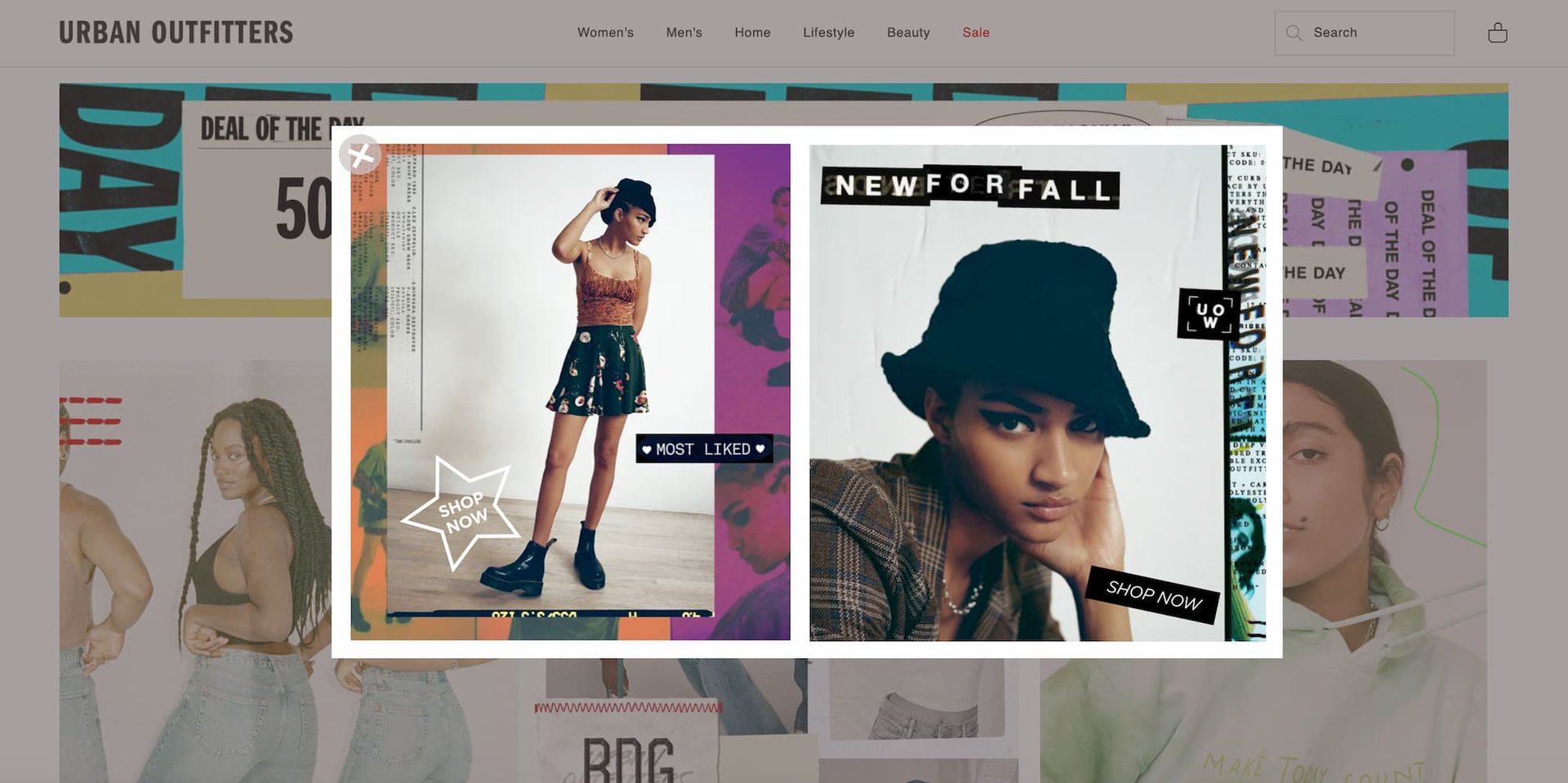
- appear on the New Arrivals page of a clothing store’s site, offering a lookbook and styling guide for the newest arrivals
- appear on the Vegetarian Recipes page of a food blog, offering a downloadable compilation of plant-forward recipes
- appear on the New Arrivals page of a clothing store’s site, offering a lookbook and styling guide for the newest arrivals
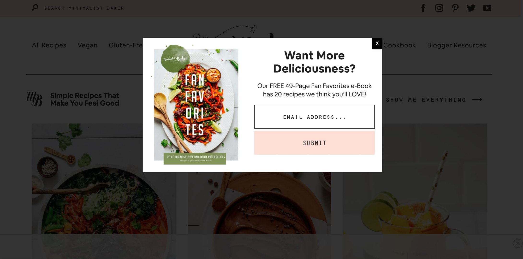
Here’s an example of relevant gated content, courtesy of (really, really good) food blog, Minimalist Baker.
Give The People (More of) What They Want
While researching for this post, I ran into this pop up from Sleeknote:
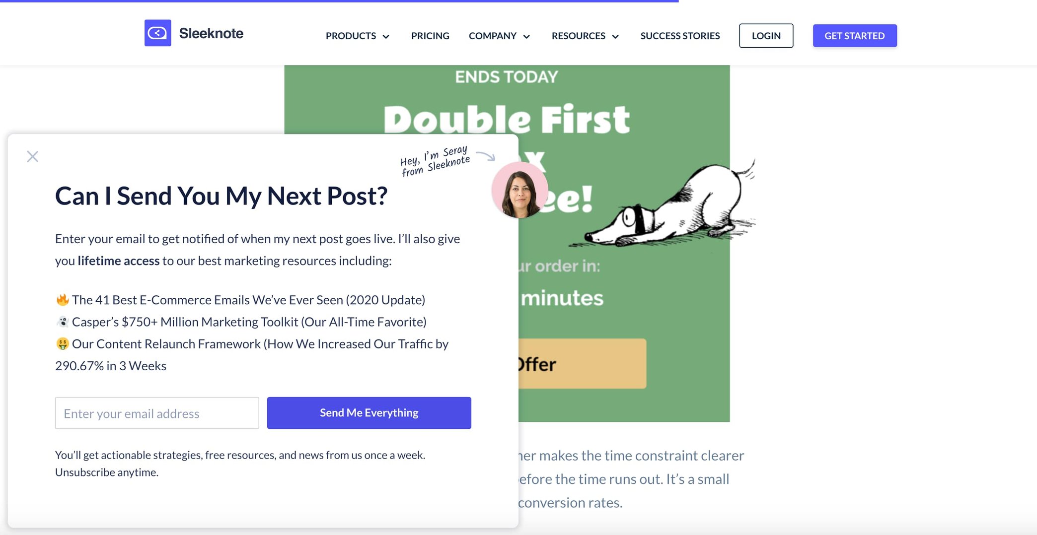
The pop up appears in one area of the site only. Can you guess what it is?
If you guessed the blog, your deductive reasoning does not suck. Yay!
Sleeknote knew their content had already drawn my attention, and they waited until I was halfway through one of their posts before asking if I’d like to see more. Plus, they threw in extra goodies that are directly related to the subject at hand (content marketing).
The pop up avoids “sales-y” language (asks a question: “Can I…?”), clearly explains the offer, is relevant to my interests, and only requires my email address. Sold!
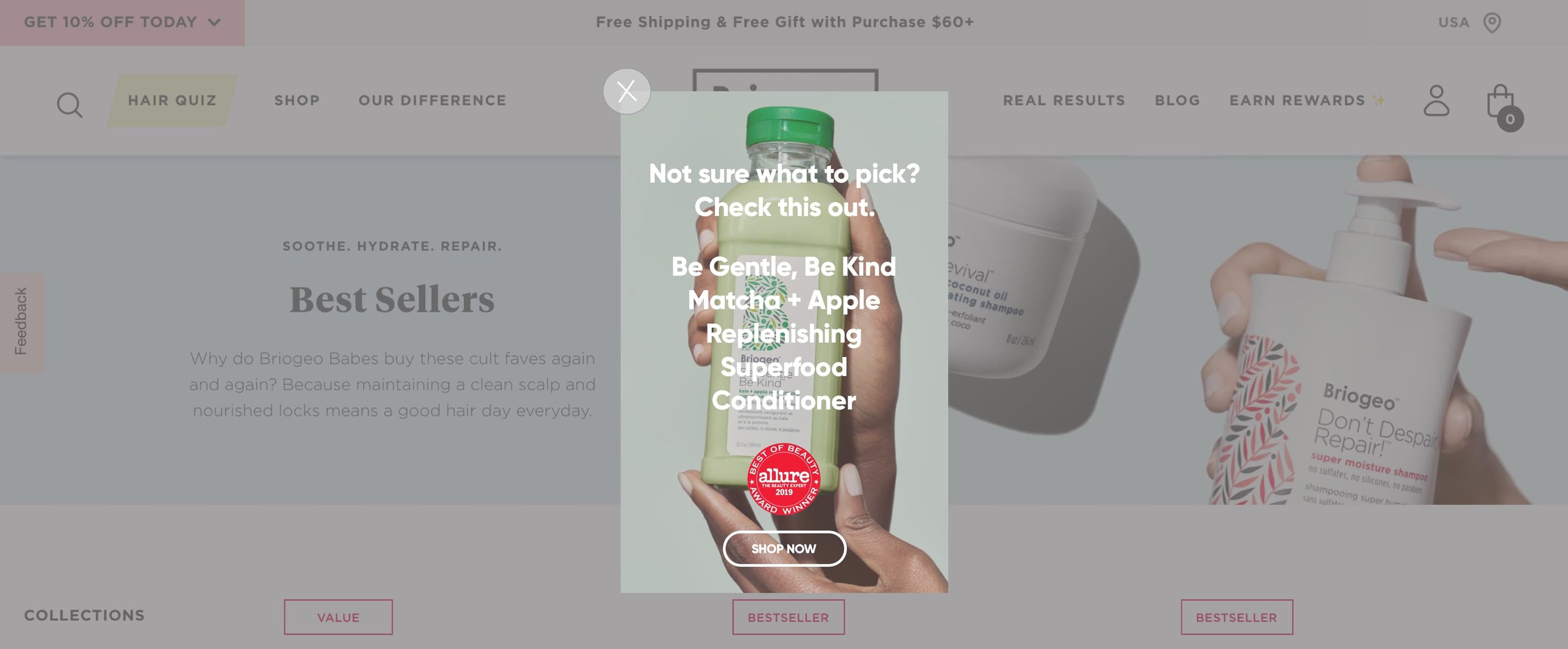
Show Off
If you have a product that has sold particularly well in the past or has garnered press attention, a simple, well-timed pop up can strengthen sales and brand awareness.
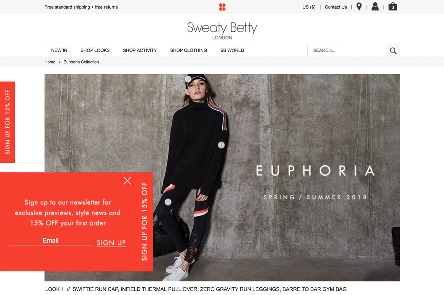
Make Pop Ups More Voluntary
If you’re really worried about the annoyance factor, you can use a click-through sticky bar-to-pop-up approach. Place a stand-out bar somewhere on your webpage, include an enticing CTA, and then hit ‘em with the pop up, a la Sweaty Betty (circa 2018).
Pop ups are one of the most basic tools in the e-commerce toolbag, and most merchants throw them on as a given--but few do so thoughtfully. If you’re going to take the time to do it, at least take a stab at doing it well, right?
First of all, use the right tools. Secondly, put yourself in the consumer’s shoes and think critically: “Would this compel me?” If the answer is no, review the strategies we’ve outlined above before trying again, to make the MOST out of this useful (but oft-abused and much-maligned) e-commerce feature.
Still want help executing great pop ups, or need other marketing advice? We know things.