Tako Agency’s creative team is at it again!
Last month, we were honored and thrilled to be notified that our web design work won two Hermes Awards!
We scored Platinum recognition in the category of “Website Overall - Redesign” for our recent overhaul of the Tako Agency website.
Our design and development work on Growth Machine’s homepage netted Gold recognition in the “Web Element - Landing Page” category.
Hermes Creative Awards honors the messengers and creators of the information revolution. Armed with their imaginations and computers, Hermes winners bring their ideas to life through traditional and digital platforms.
The Awards are administered and judged by the Association of Marketing and Communication Professionals (AMCP), one of the largest, oldest, and most respected evaluators of creative work in the marketing and communication industry.
It seems poetic that the work garnering the highest award was truly a team effort at Tako. Creative Director Grace Everitt created an environment where our team of designers and illustrators (Ekrem Ates, Caleb Lai, Hazal Kutlu, and Denisa Herman) could stretch their creative legs and push themselves.
The end result was a refreshed brand complete with custom illustrations, new pages, new fonts, and a color palette that sets us apart from other agencies in our space.
(Curious to know how to refresh your brand? We wrote about the process here.)
Growth Machine was a completely custom build on every page, but the homepage is the hero. Designer Caleb Lai led the charge on a complete brand refresh, including their logo and color palette.
First, he conceptualized a logo that better reflected their growth and maturity as an agency -- moving away from the “start-up-y” rocket and swapping in a stylistic “G” icon overlaid with growth bars, as on a chart. We kept their core color of dark purple as a nod to their origins, but injected a bit more sophistication with a richer color palette that included blues and lavenders.
BEFORE
AFTER
Then we turned our attention to the homepage, creating a hero that strayed from the expected by avoiding been-there-done-that images and instead, embraced a modern eye-catching prism that mimics the upward growth trendline on a data chart.
The concept of the prism carried through the rest of the page, accented by custom illustrations, a few special animations, and a tight focus on only the most important pieces of their value proposition.
Check out their before and after:
BEFORE
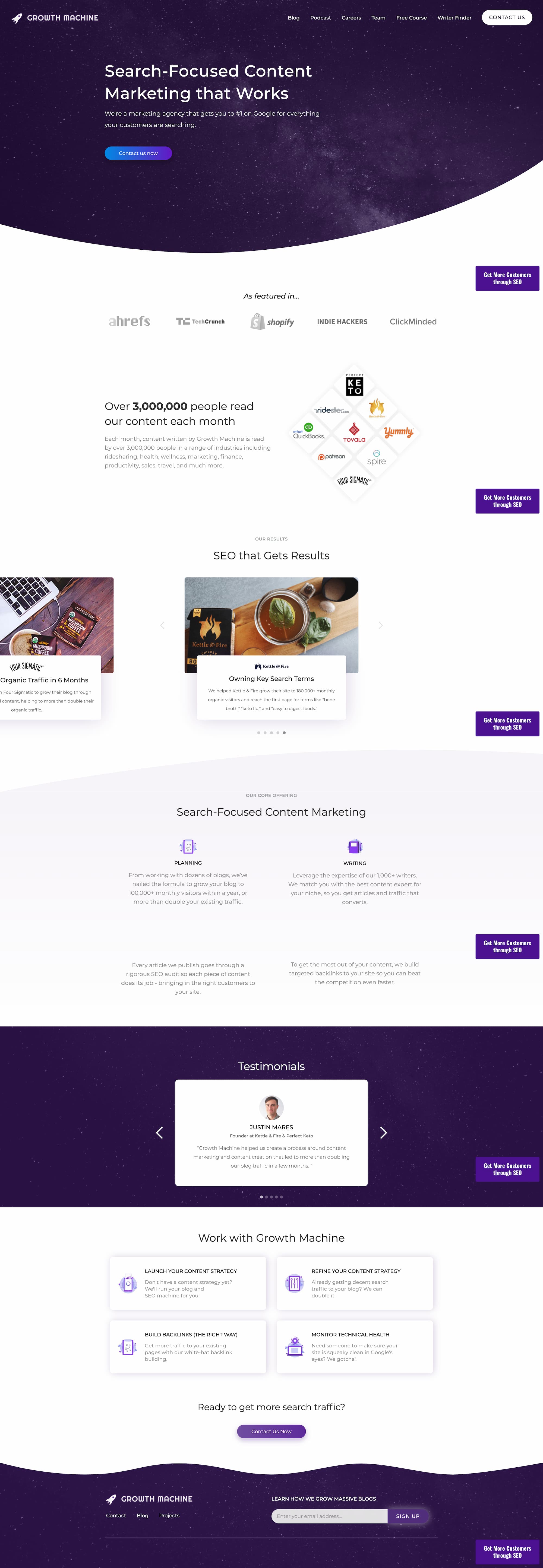
AFTER

Growth Machine is a top-notch content marketing and SEO agency, so definitely check them out if that’s something you’re looking for. It was a pleasure working with Nat, Nora, and Amanda on re-visioning what the future of Growth Machine would look like online.
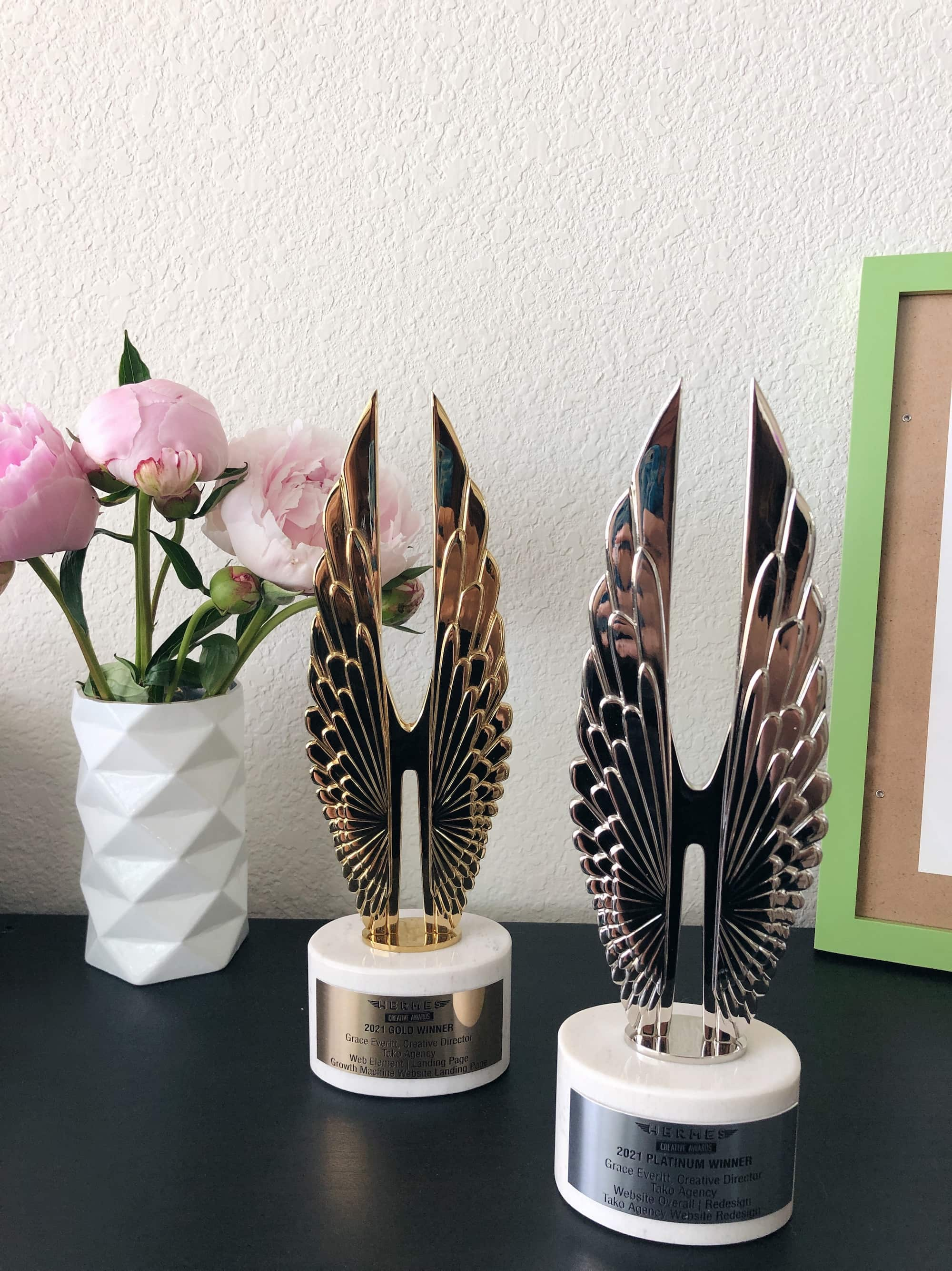
We’re humbled and ecstatic that our commitment to being a design-first agency is being recognized and valued.
Keep your eyes peeled for even more incredible work from Tako Agency this year!
Interested in working with us? Contact us here anytime.


