


So you’re going to build a shiny new Shopify store (or you’ve decided it’s high time for a little rebranding). Congratulations!
One of your first orders of business will be working with a creative team to turn your ideas and vision into a living design.
Being that Tako has always been a design-forward agency, we understand that site design can be a complex and baffling process for many clients, so we’ve put a lot of energy into making sure merchants are well-prepared from the start.
To that end, whether you go the agency route (heyyyy) or assemble a team of dynamic freelancers, here are 7 tips that will make it infinitely easier to work with any creative team.
1. <Shakes Pom Poms> Be Spe-cif-ic, Be-ee Spe-cif-ic!
A.K.A. “I Want It To Pop” and Other Phrases That Make Designers Want to Leap Into Traffic.
Specificity--from both client and creative--is perhaps one of the most common hurdles faced during the design of an eCommerce site. Creatives may assume you know things you don’t. You might assume your preferences are understood. Tragedy inevitably ensues.
Consequently, the first step to achieving ultimate precision (and inner zen) is killing the evil Assumption. Communicate, communicate, and communicate again. From our experience, we’d always rather clients confirm things one or two times more than strictly necessary instead of assuming and running the risk of disappointment and/or delay.
After that, all it takes is a little intentional fine-tuning of language. For example:
🚫 “I want our new products section to pop.”
✅ “I really want to draw visitors’ eyes to our new products section. I think it would be cool to use one of our brighter accent colors. How can we do that?”
Even if you don’t know exactly how to achieve your ultimate goal, (I mean, you hired designers for a reason, right?) being clear about your preferences and objectives from the start ensures that everyone is headed in the same direction.
Specificity is particularly critical when dealing with web design, for a couple of reasons:
Design is foundational. Much like a home build starts with a blueprint, a site build begins with design. While it’s not (always) impossible to tweak the configuration of a “room” once you leave the design phase, significant changes during development or post-delivery take time and money.
Web design is equal parts art and science. When your site is finished, it should be beautiful. It should also work. A common misconception is that a design team is only concerned with the beauty bit. The fact is, design teams worth their salt (hi, hello, we have one of those 🙋) design for form and function.
That means you’ll need to be very specific not just about what you want your site to look like, but also what you want the user (and you, the merchant, editing the theme) to be able to do with it.
Why? Because it’s the creative team’s job to relay the intended functionality to the development team. If you don’t tell them you want to be able to swap the order of an image and a block of text, for example, that functionality will not be conveyed to the developers, and you’ll be delivered a site with fixed images and text. (Whomp, whomp.)
2. Include All Decision Makers, All the Time
Anyone on your team whose preferences or opinions will have sway on the final product should be included in the design feedback process--every step of the way. This is important because, in web design, things that may seem insignificant can still be very difficult to change later.
Including all shot-callers at all feedback points keeps everyone on the same page and protects you from costly adjustments to form and function down the line. (Just please make sure you’re all on the same page internally before relaying feedback to your creative team. Nothing puts a creative team in a more awkward position than receiving conflicting requests.)
3. A Wireframe is Not a Design
What a Wireframe Is
A wireframe is an optional first step of the design process, usually recommended only for more complicated layouts or those projects with many decision makers, where a sudden reversal in design could be complex.
It is a bare-bones “mockup” of what the new page will look like. We mean skeletal: stock imagery or other visual placeholders, lorem ipsum text, no color, branding, or special fonts, etc.
The purpose of the wireframe is to set up the master layout of the page: where is the header nav located? Where are images and text? How are CTA buttons positioned?
For example, a site with a Minimalist approach probably doesn't need a wireframe
For something more complex or unusual, a wireframe might be recommended. (It just depends on your timeline, budget, and unique needs, honestly.)
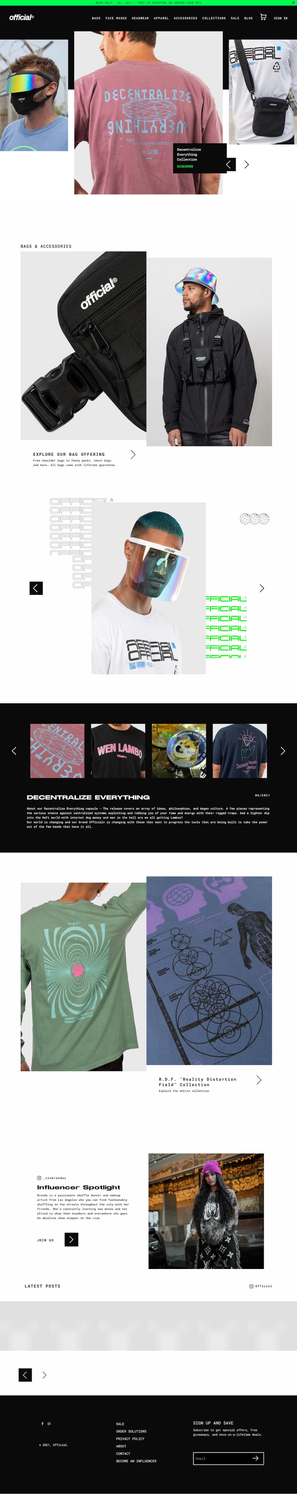
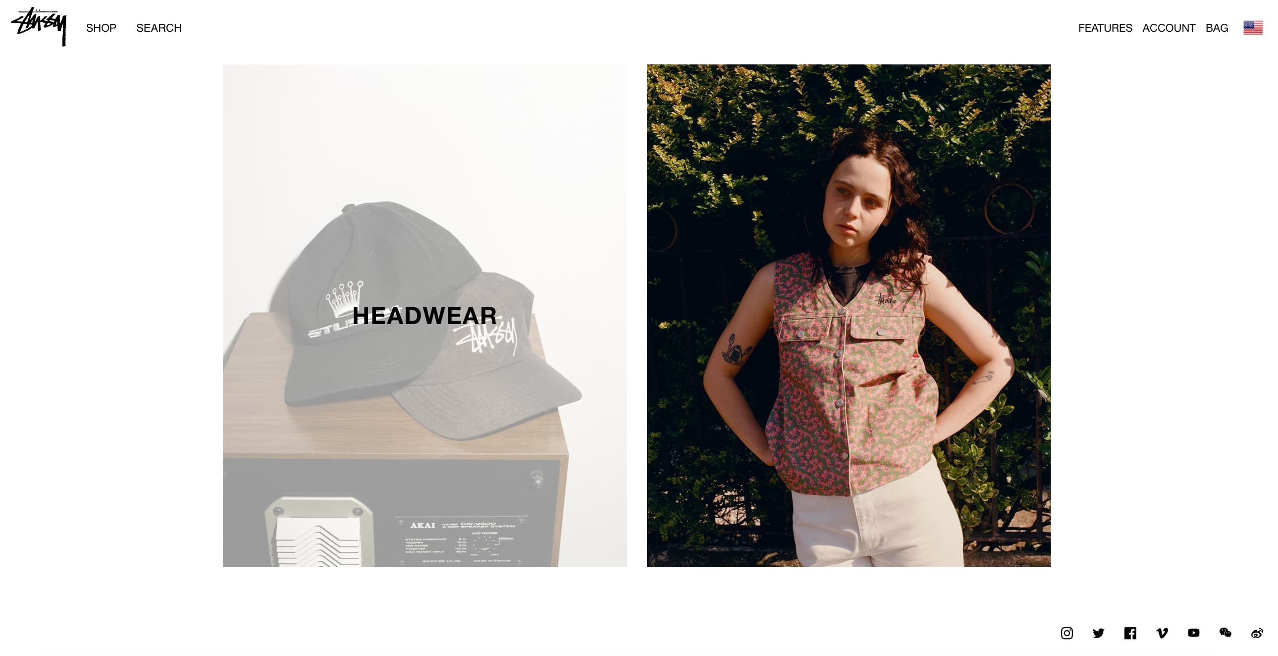
(Why yes, that's a dope Tako Agency design, thanks for asking.)
A wireframe may present a highly simplified version of your site, but you should still be doing a full happy dance over the layout it expresses before moving on to the high fidelity design. Making major structural changes once the project moves into the next phase can be costly and time consuming.
OK, What’s a High Fidelity Design?
A high fidelity design is a complete prototype of your future web page--what you see is what you get! Hi-fi designs will be fully fleshed out with images, icons and other visual assets, your branding (colors, fonts, logos, etc.), copy*, headers and footers, navigational menus, and more.
*Some teams may offer copywriting services (we do!) but most will require you to write the copy yourself, meaning the hi-fi design will be stocked with replaceable lorem ipsum text.
Most importantly! (Yes...bold, underline, italic important.) Whatever you see in a final design is what will be sent into development and, therefore, what you'll see when the completed site is turned over to you. That means the presentation of the hi-fi design is a critical moment to look very, very closely to be sure it’s exactly what you want.
Changes requested after development begins will always take more time than changes requested during the design phase; and you know what they say about time… 💸
Look at Mobile Designs on a Mobile Device
Desktop devices just don’t replicate the experience a user will have with the delivered mobile design. It’s always best to review mobile designs on an actual mobile device, so you can get a better sense of what the design will look like when it’s in the palm of your hand.
UX and UI Are Not the Same Thing
...and if you use those terms interchangeably, your designers will get confused.
The UX
UX stands for User Experience. Put simply, user experience refers to what happens when users interact with the UI (and how easy it is for them to do so).
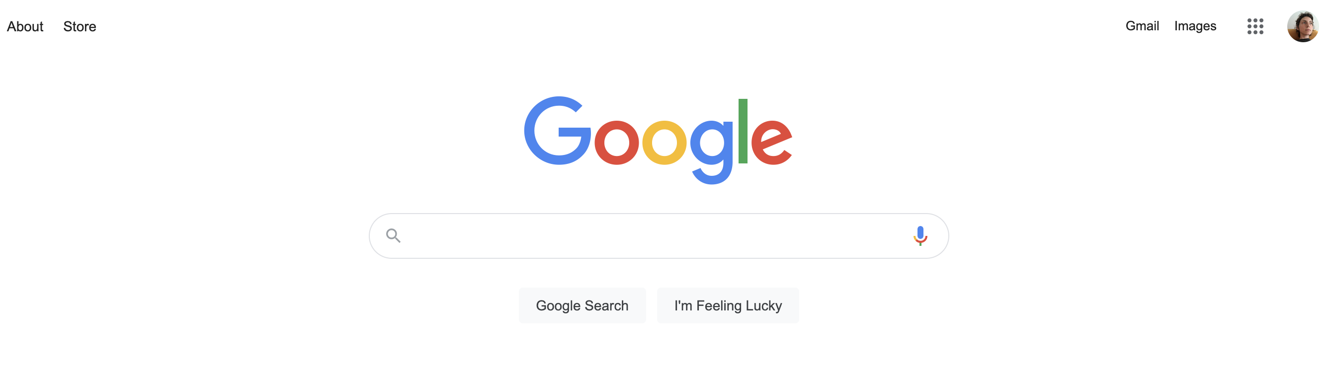
Let’s talk about Google. As you’re probably aware, if you go to google.com, you’ll be presented with a search bar, square in the middle of a nearly blank page. (That’s great UI for Google's purpose, by the way...but more on that in a minute.)
The quality of the UX is tested when you actually use that feature. The experience should be intuitive and seamless. Things like:
-
- Being able to click anywhere within the search bar to start a search
- Being able to run the search by tapping the Enter key instead of having to leave the keyboard to click the Search button
- How quickly results load once the search is run
The UI
UI stands for User Interface, which Wikipedia defines as the space where interactions between humans and machines occur.

Er.
More relevant to the design context, user interface refers to pages, buttons, colors, images--all the things people tend to think about when they think “web design.” It's the "how" to UX's "what."
Good UI leverages visible elements to support the goals of UX: give users a consistent and delightful site that makes it as easy as possible to achieve their goal.
A frequently cited example of good UI is Google’s landing page. (Told you we’d come back to it.) Google knows why you’re visiting: you want to search for something. Their interface is great for a few reasons:
-
- The Google logo is front and center, so users immediately know they’re in the right place
- The page is clean--free of extraneous images, buttons, etc.
- The search bar is smack dab in the middle of the user’s line of sight
- The search bar is marked with an eyeglass, making its function obvious
So no, UX and UI are not the same thing, but they do work together simultaneously to create an intuitive and enjoyable experience for your customers--and it’s important that they do! We’ve said it before, we’ll say it again: good UX and UI are critical to eCommerce success.
Understand the Limitations of Some Apps
Customization of third party apps can be limited, which means your creative team may not be able to create a completely cohesive experience between your site design and the app you use for product reviews, for example.
It’s important to--with your designer(s), before the hi-fi design really gets rolling--take stock of any apps and widgets with which your customers will interact, to identify where customization is and is not possible.
The Best Work Does Not Come from Copying Others
Imitation may be the sincerest form of flattery, but it’s also a death knell for merchants who want to actually make an impression on their customers (and would-be customers).
“We want it to look exactly like Blah Blah” is the most disheartening, boring thing a creative team can hear. If you’ve hired a designer (or designers), you should trust them to create something that is unique, compelling, and you!
Working with a talented creative team can be an exciting experience! Being clear with your objectives, likes, and dislikes -- combined with trusting your team as they make suggestions and pitch ideas -- can leave you with a product that’s even better than you ever dreamed it could be.
Still on the hunt for the perfect creative team? Now we’re talkin.

